Together Video App

An accessible video conference app for elders and children

Together is a video chat app specifically designed for children to interact with long distance grandparents. Over the course of 3 weeks, our team designed this app's interface to be more accessible and user friendly, conducted thorough user testing, and incorporated feedback from critiques to finalize an interface design. We contacted the founding team of the app to share our findings and proposals for improvements.

ROLE

UI/UX Designer
User Researcher
Usability Tester

TIMELINE

Three weeks (2020)

TEAM

Jessie Li
Ethan Mullen
Kelly Wang

CHALLENGE

Long distance familial relationships, especially during lock-down in a pandemic, can be strained. Especially for the demographic of elderly folks and their grandchildren, both of which have a high likelihood of having trouble navigating technology, how can we design an app that meets the needs of both populations and bridge the gap of distance and emotion?

SOLUTION

Together Video App is an accessible video conferencing app that actively facilitates bonding between elders and grandchildren, offering playful and educational activities in a memorable and easily learned virtual experience.

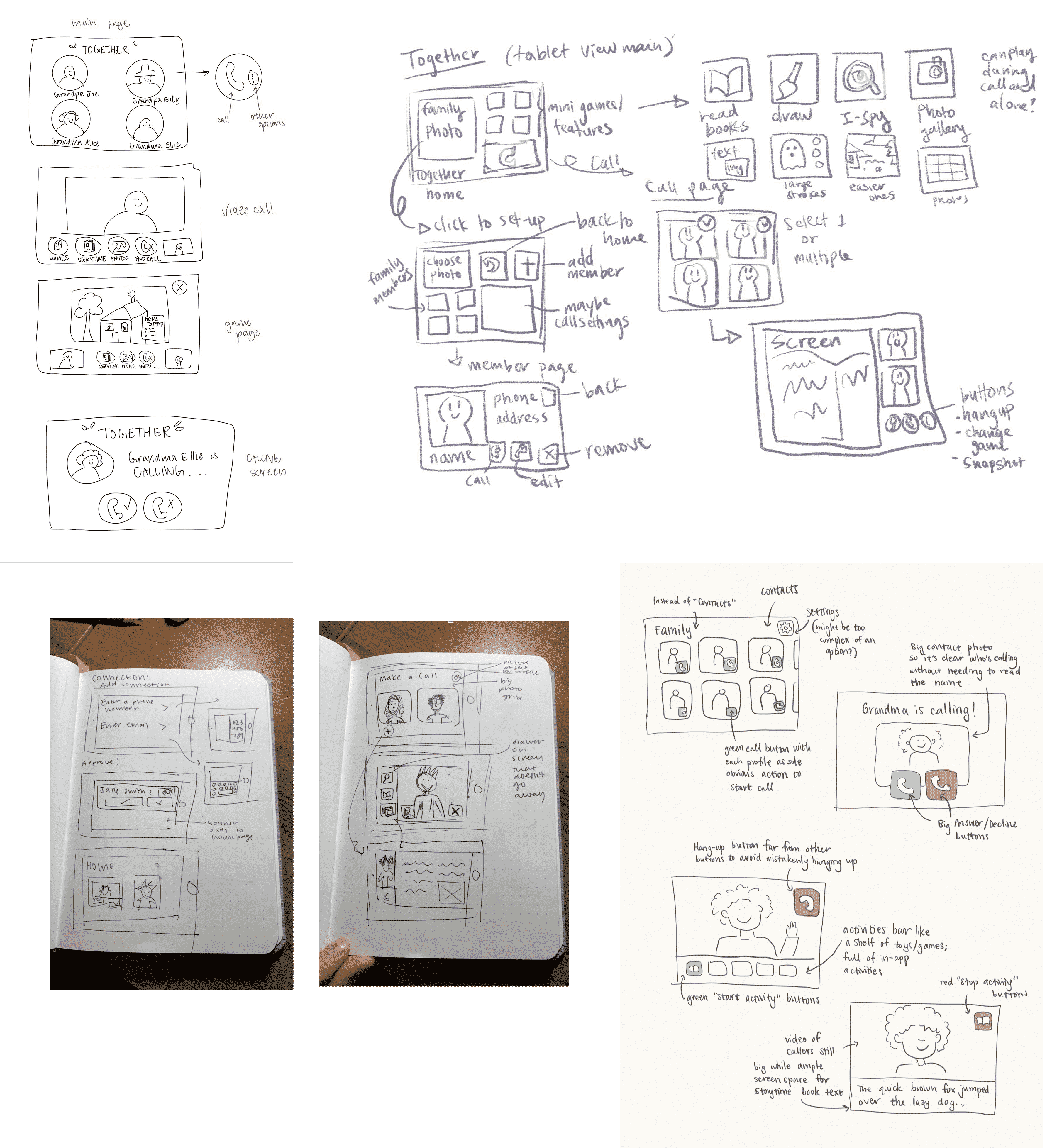
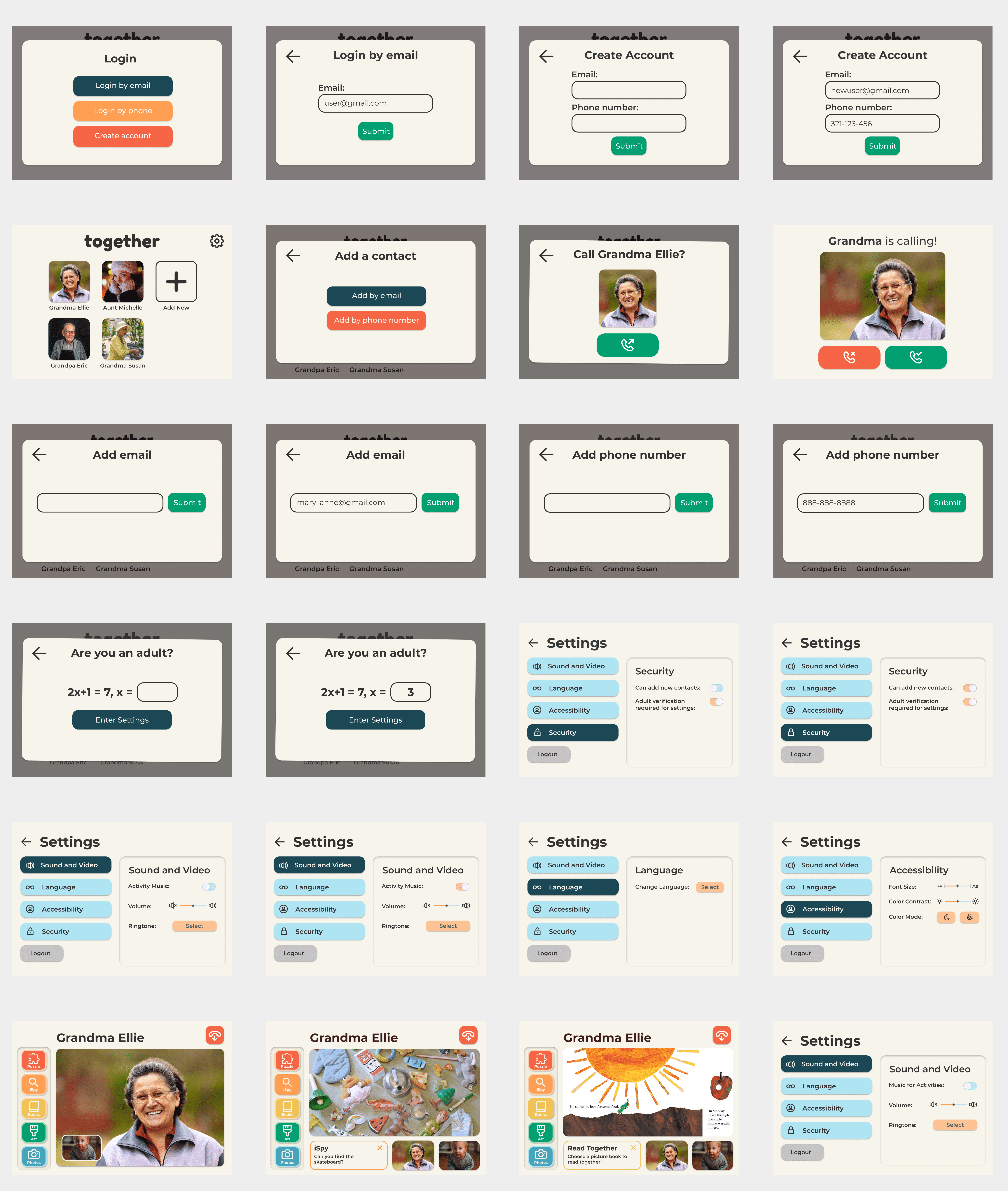
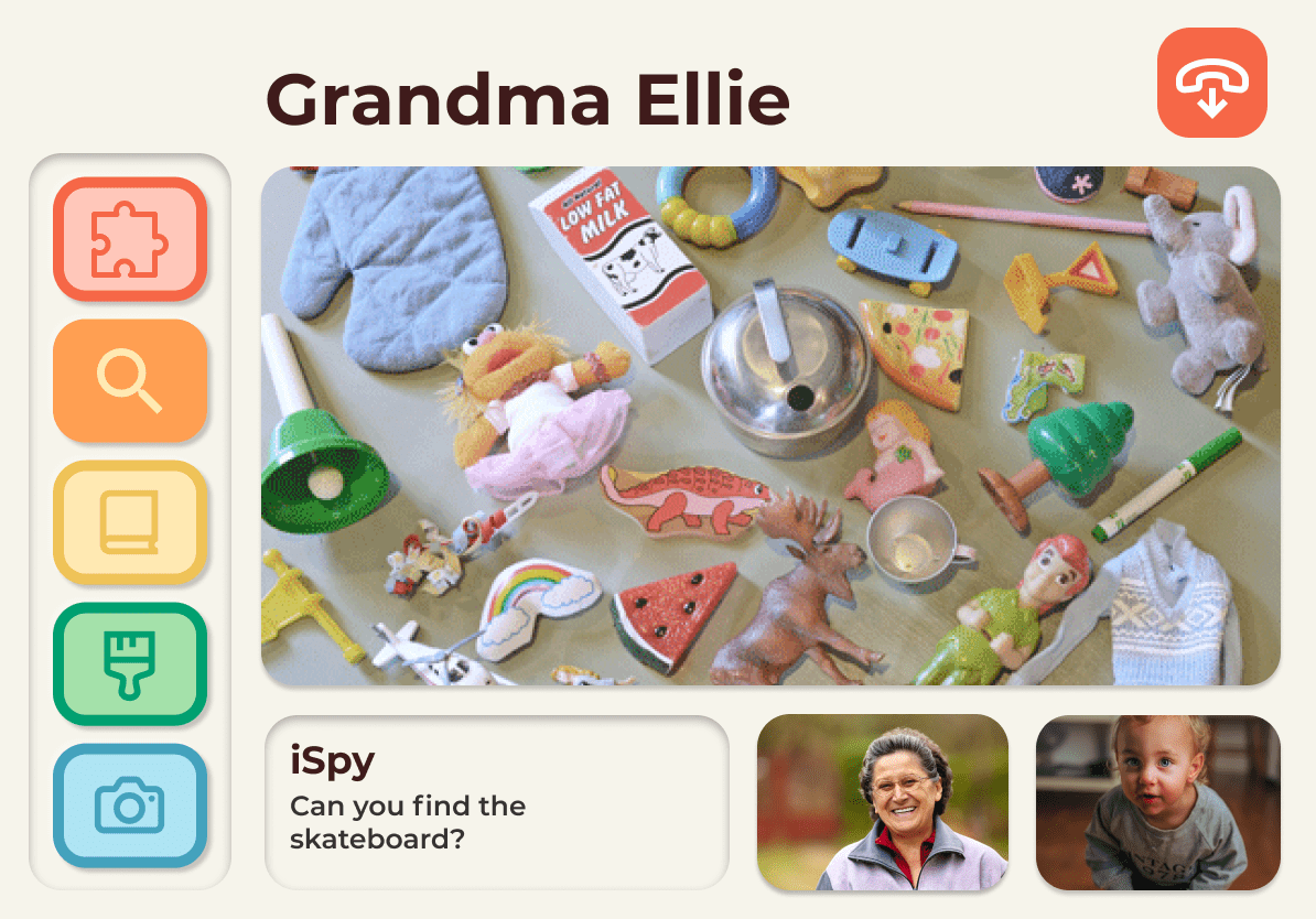
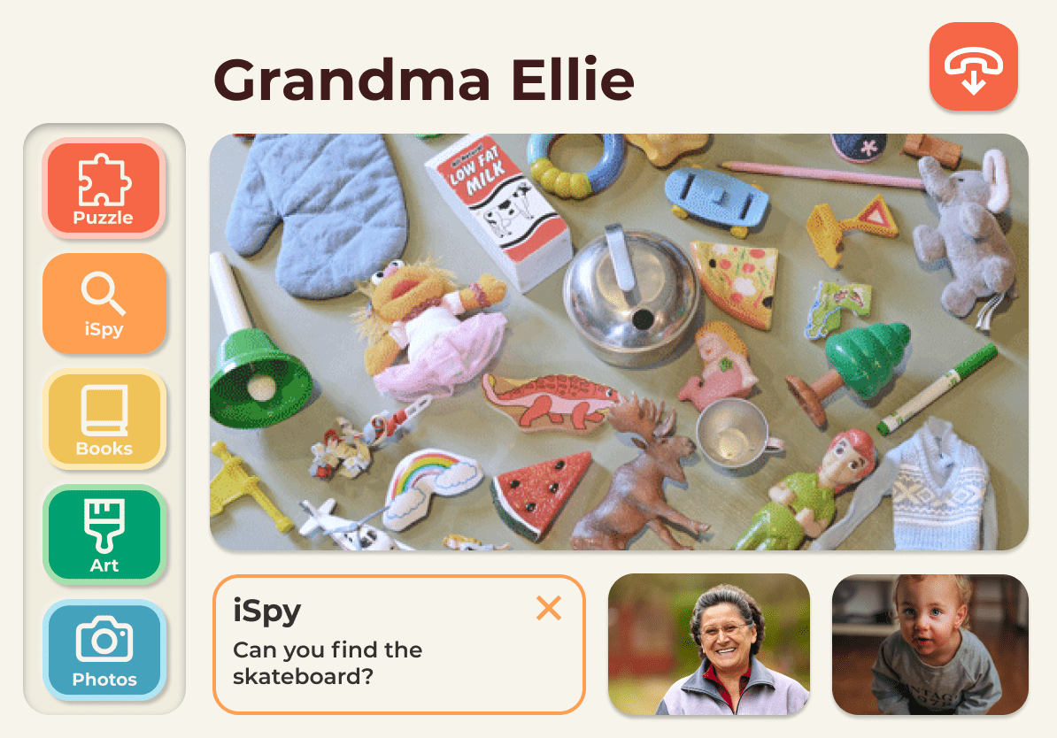
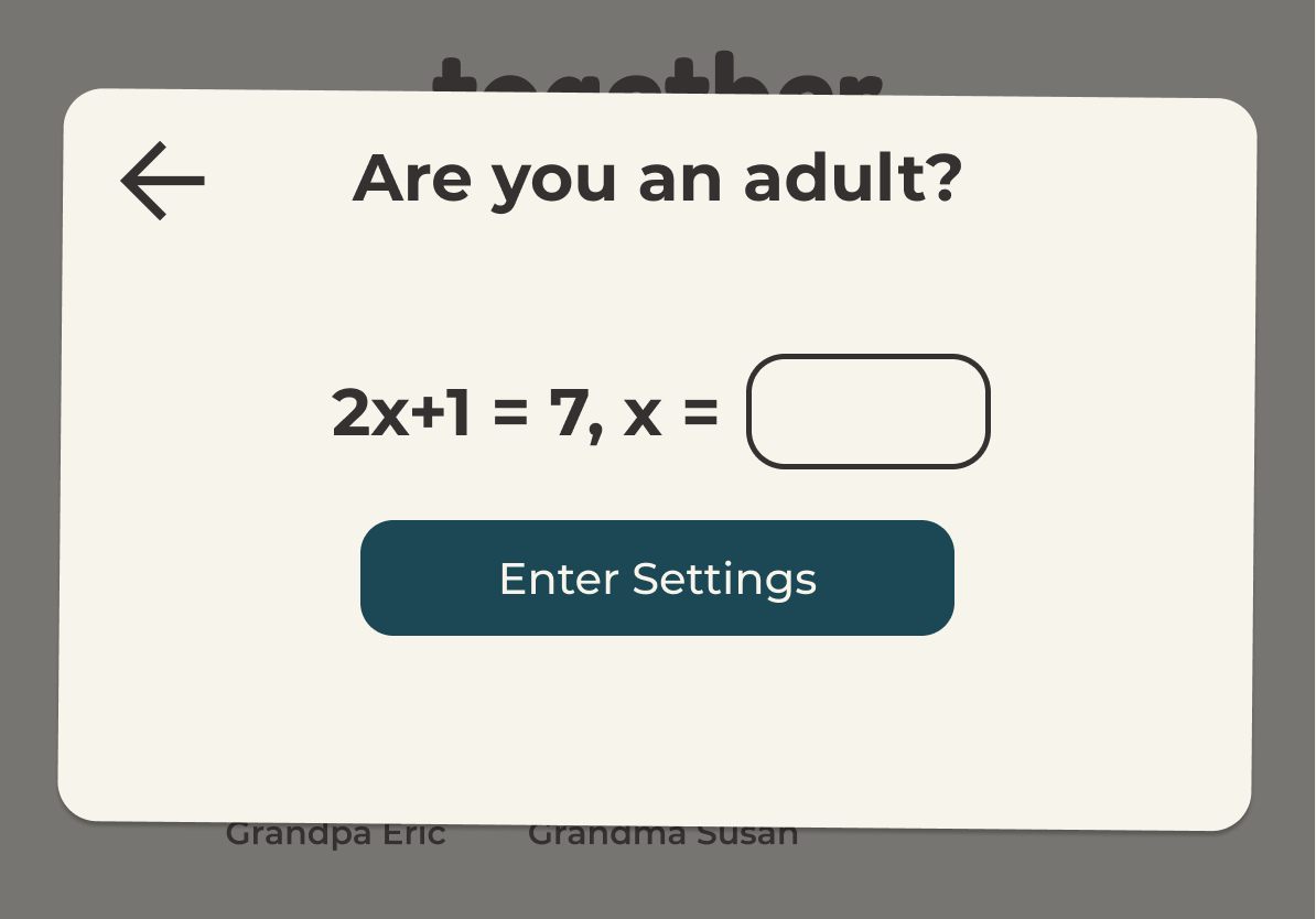
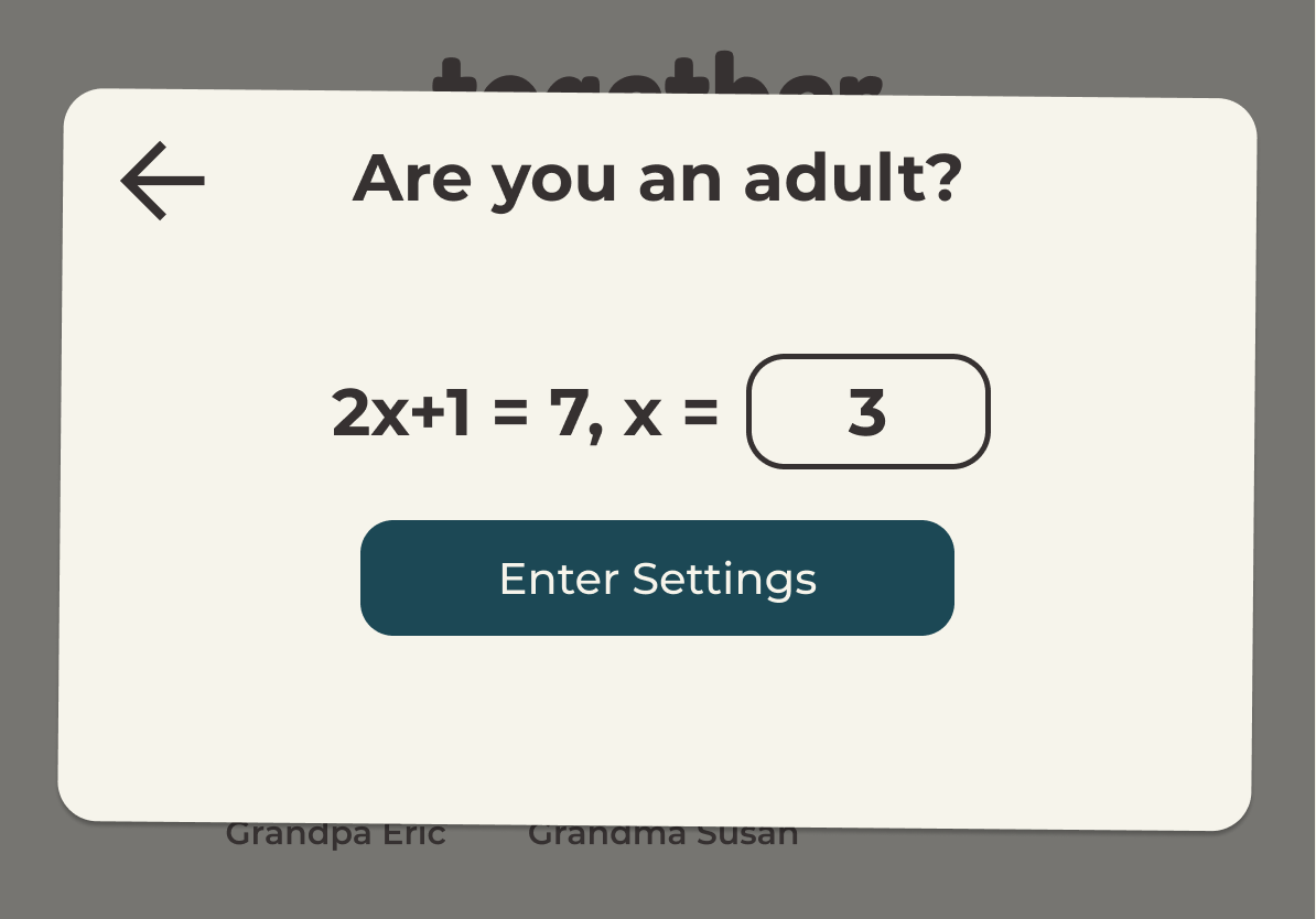
UNDERSTANDING OUR AUDIENCE

Identifying the needs of elders and children

For kids who are active and playful, a relatively static interface like Facetime and Zoom might not be the most engaging way to communicate. For grandparents who aren't technologically adept, these interfaces can be overwhelming and unclear. Together Video App serves both groups to create an emotional bonds despite the distance.

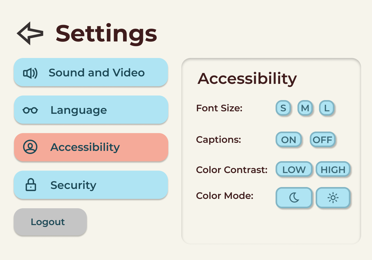
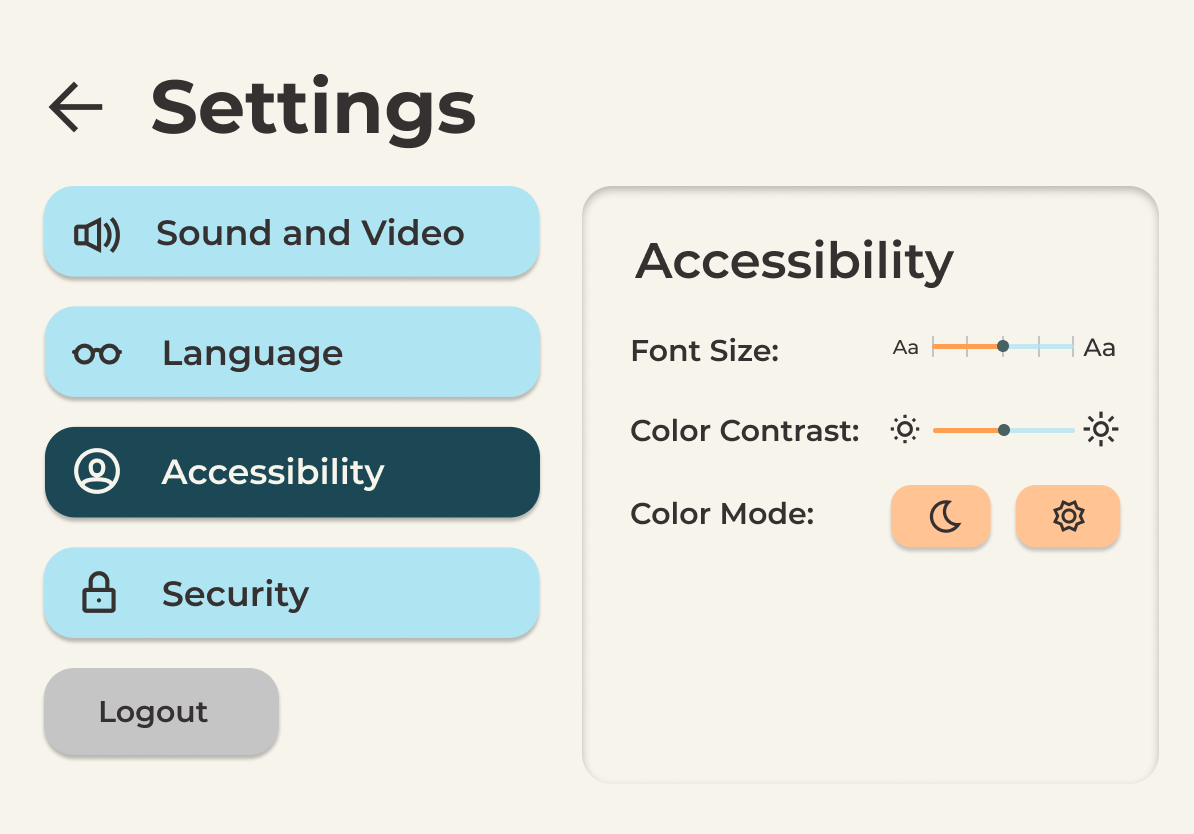
creating an interface that is easy to learn and simple to understand while also ensuring that users have a safe and playful experience.

video calling apps

IDEATION

Core Feature Identification

While it was useful to find inspiration from the structure of existing video-calling apps, no other popular video app specifically targets the needs of specifically elderly and young populations. We started off by brainstorming as many possible user interface ideas as possible; the following are our sketches.


Initial sketches of Together Video App Interface

From the sketches, we discussed and narrowed down which screens would require the most focus and iteration for addition into a valuable and effective prototype. Our discussion of design elements for each chosen screen is summarized below.


Main Home Screen

  • Considered using a family photo, but agreed that it made the page too busy
  • Thought about the process of adding contacts and incorporated a visual plus button to add contacts from the home page
  • Thought about including green call buttons on every profile picture so it would be clear that pressing on them would open a call versus having a click on the profile picture automatically call the person

In-Call Screen

  • Considered the placement of the activity bar on either the bottom or left-hand side of the screen
  • Thought about having the activities in an expandable drawer
  • Considered a group call mode but realized it may be difficult for users to navigate

Settings

  • Though it wasn't in our sketches, we also discussed the need for flexibility due to users ranging from children, parents, to grandparents
  • We decided to have one version of the app instead of having multiple different interfaces to suit different users and "admins"

EARLY EXPLORATIONS

We incorporated the strongest elements of each team member's ideas into our mockup, keeping in mind our specific audience's specific needs in regards to accessibility such as color contrast, literacy, and the interface's learnability. An important aspect we kept bringing up was the ease of navigating the user flow, knowing that users would primarily be children and grandparents.


Low fidelity wireframes of Together Video App Interface

I focused especially on our color palette, keeping in mind how kids would best stay engaged with an interface along with how grandparents would react to simple versus overloaded screens.

USER FEEDBACK

Making accessibility the core of our application

We presented our prototype at a critique session with a professional UX Researcher, and received feedback and pointers on how to best approach different aspects of design that needed more iterations– most importantly, in the realm of accessibility and how we can make sure it stays central to every design decision. The general comments and takeaways of our session, as well as examples of specific cases where we then iterated on their feedback and advice, are summarized below.

General User Feedback Takeaways

  • More specific labeling and directions for the activity icons
  • Making the app kid-safe, protecting the settings
  • Consider a parental perspective in terms of protecting children
  • Show physical differences for font size
  • Some settings don't really make sense as buttons
  • No clear way to exit from activities
  • General compliments on aesthetic and interface :)

DESIGN DECISIONS + ITERATION

In-Call Activities

BEFORE:

Pre-critique version of in-call screen

AFTER:

Post-critique version of in-call screen

We added text labeling each button, added contrast to the colors of each button, and created an 'x' in the description area that allows the user to exit the activity.

Child Safety Features

BEFORE:

Pre-critique version of adult verification screen

AFTER:

Post-critique version of adult verification screen

We wanted to ensure that parents had some control over how kids could interact with the app, and after debating possible solutions, we included a math problem before granting access to the settings. We thought that this would provide enough protection to deter kids, but not make it a hassle for grandparents and parents to access.

Settings Accessibility

BEFORE:

Pre-critique version of settings screen

AFTER:

Post-critique version of settings screen

We renamed some settings and included sliders instead of only buttons. For example "contact filter" was renamed "can add new contacts," and font size and color contrast are sliders. We also made the changes in text size more obvious.

USER TESTING

After incorporating feedback from our critique into our design prototype, we conducted user testing. We provided each of our users with a set of tasks, and watched recordings of them performing each sub-task and answering post-test questions.

User Testing Tasks:

  • Please create an account
  • Please go to settings and turn off background music
  • Please simulate adding a new contact by phone number
  • Please call Grandma Ellie
  • Please play a game of iSpy with Grandma Ellie
  • Please read a book with Grandma Ellie
  • Please hang up the call

User Testing Post-Test Questions:

  • Which task was the most confusing to accomplish?
  • What do you think about the visual design and layout of the application?
  • Are there any elements which you find redundant? Are there any elements you think the application is missing?
  • Would you use this application with your family? Please explain.

User Test Findings

We expected users to be able to log into the app, make a call, and explore a few options we had for in-call activities as these were our app's main features. Most users were able to complete the tasks easily, and we also received some compliments about how simple & easy to use our interface was.

User Sub-Task Performance:

  • Two users were confused by whether or not they had finished the task of adding a contact due to lack of feedback after task completion.
  • They were also confused as to whether they had correctly identified the location to execute certain tasks, like inactivating music, due to naming disparities among the screens and instructions. Some buttons were also not fully functional in our prototype.
  • Another was confused because they couldn't actually fill in the information needed for tasks, as we used dummy information to fill in inputs for them.
  • Confused as to whether or not clicking a profile picture in the home screen would initiate a video call, since there was no clear indication that it would do so.
  • Unfortunately, we didn't mock up the entire process of adding a contact, and a user commented that she would've liked to see the added contact appear on the screen.

FINAL FEATURES

Here's a rundown of our most important features and design decisions! We contacted the founding team of the app to share our findings and proposals for improvements.

Toybox Skeumorphism

Easy visual translation of a physical toybox onto the screen, simple symbols and bright colors makes it easy to understand

Engaging In-Call Activities

Games and puzzles available alongside video calling to let grandchildren and grandparents play and spend time together

Assessibility Settings

Robust customization of screen to accomodate accessibility needs

IMPACT

Parents expressed an immediate understanding and excitement of the concept and could see how they could use it with their children and their grandparents. One especially enthusiastic user said the following:

"I love the idea of this. This is so smart. I love this. Grandma lives so far away, so how do you interact with Grandma? How do you play games with Grandma? How do you do anything besides 'How was your day? How was school?' This gives you the platform and the games to play while you're actually interacting!"

TAKEAWAYS

Value of user feedback

Before starting this project, I was a visual designer with little experience in user research. The two weeks provided a focused deep dive into how to make decisions informed by actual user feedback.

Defending design decisions

This was also my first time working on a design project with a team of other designers, and we all learned how to communicate and defend our own design decisions as well as provide constructive critique. Having user feedback to back up decision decisions proved itself invaluable.

Weighing varied needs within an audience

With an audience with such different and specific needs due to age and generational differences, it was an important challenge to see how we might address the specific necessities of different people's experiences.