filtered.ink
Unlocking the possibilities of vector-based animations through usability tests and interface redesigns.
Role
Experience Designer
UX Research Assistant
Duration
Jan 2022 - Jan 2023
Team
Tongyu Zhou
Jeff Huang
Tools
Figma
HTML / CSS
JavaScript
Background
Wait, so what exactly is an SVG Filter?
An SVG filter is a series of tranformations that can be applied to SVG graphics. Imagine an Instagram filter, but one that makes an SVG image change color, opacity, or even move. Yep, with SVG filters, you can make an SVG file display moving images, while still maintaining all the benefits of the SVG format (compact file size and infinite scalability). Here's a much more in-depth article about why SVG filters are awesome.
Some example transformations that SVG filters can do!
Understanding our audience
Identifying existing challenges
The bulk of my work as a research assistant was improving the existing interface of our new vector-based art tool. While assessing the state of the existing design, there were a few challenges that we had to keep in mind.
Problem definition
How might we redesign a vector-based animation tool to introduce the use and capabilities of
SVG filters to non-technical artists as well as creative technologists?
Competitor analysis + design patterns
What's already out there?
With our problem statement defined, the first step was to observe how animation and creative tools were currently constructed. We carried a design audit of existing digital creative tools, especially those that are vector-based. We took note of aspects ranging from their functionality to the layout of their tools!
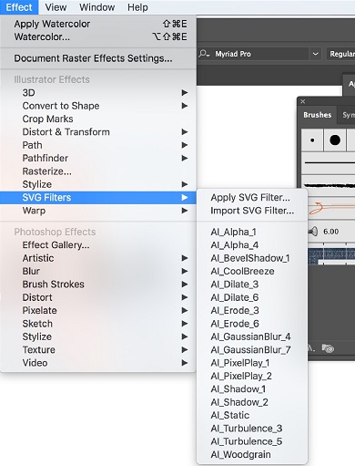
Adobe Illustrator's (lack of) SVG Filters
The limited SVG Filter functionality on Adobe Illustrator is extremely difficult to access and understand, requiring both a previous awareness of this functionality as well as coding prowess to wield the different transformations possible. There is no GUI or additional information for non-technical artists and designers.
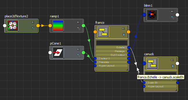
Autodesk Maya's Interactive Node Editor
Maya's node editor did a good job of showing the hierarchy and relationship between functions.
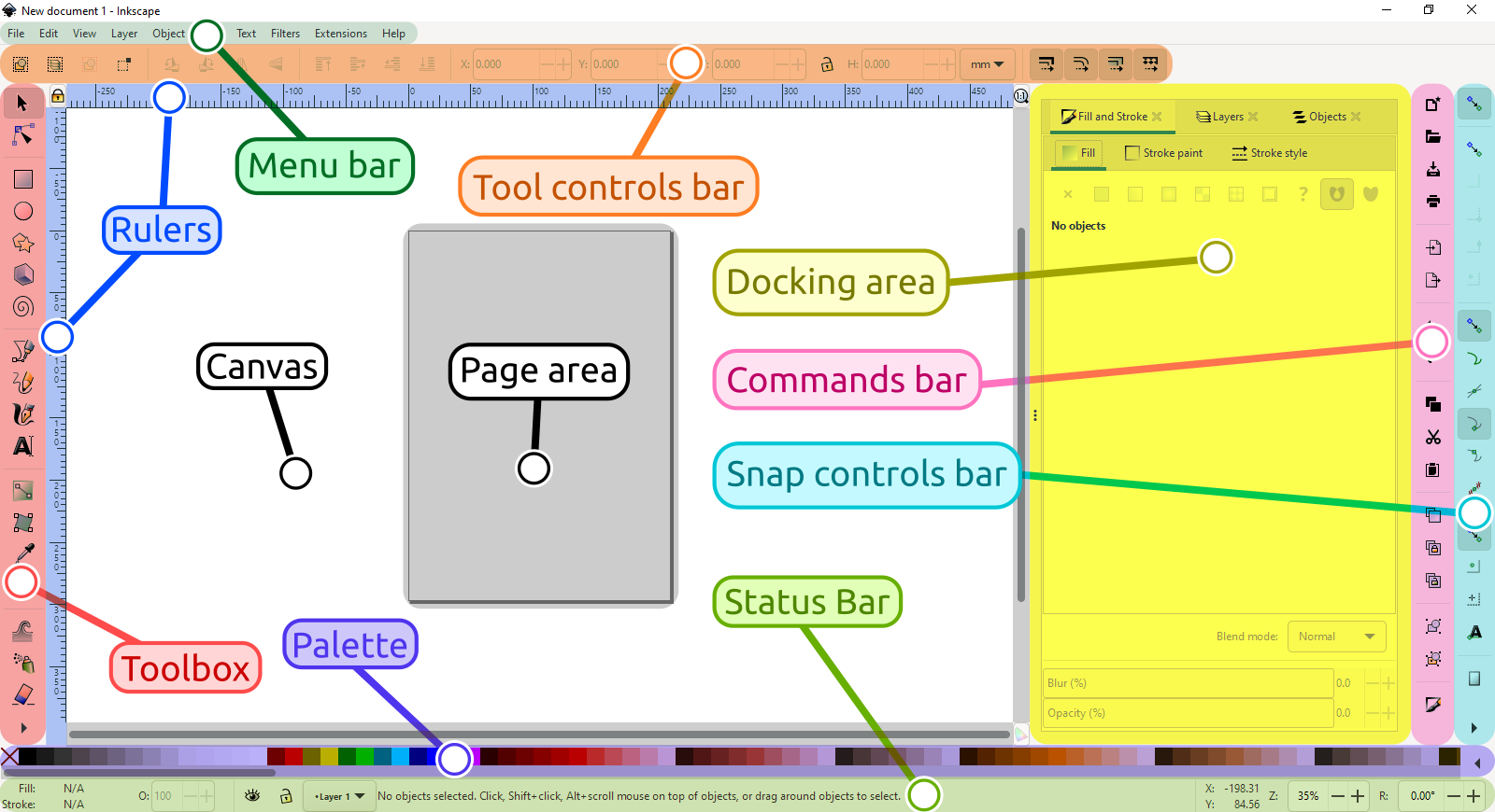
Inkscape Vector Editing Interface
Inkscape's SVG functionalities were the most diverse, and we noted the robust layout of their editing interface.
Ideation + iterations
Pain Point 1: Indistinguishable Node Connections
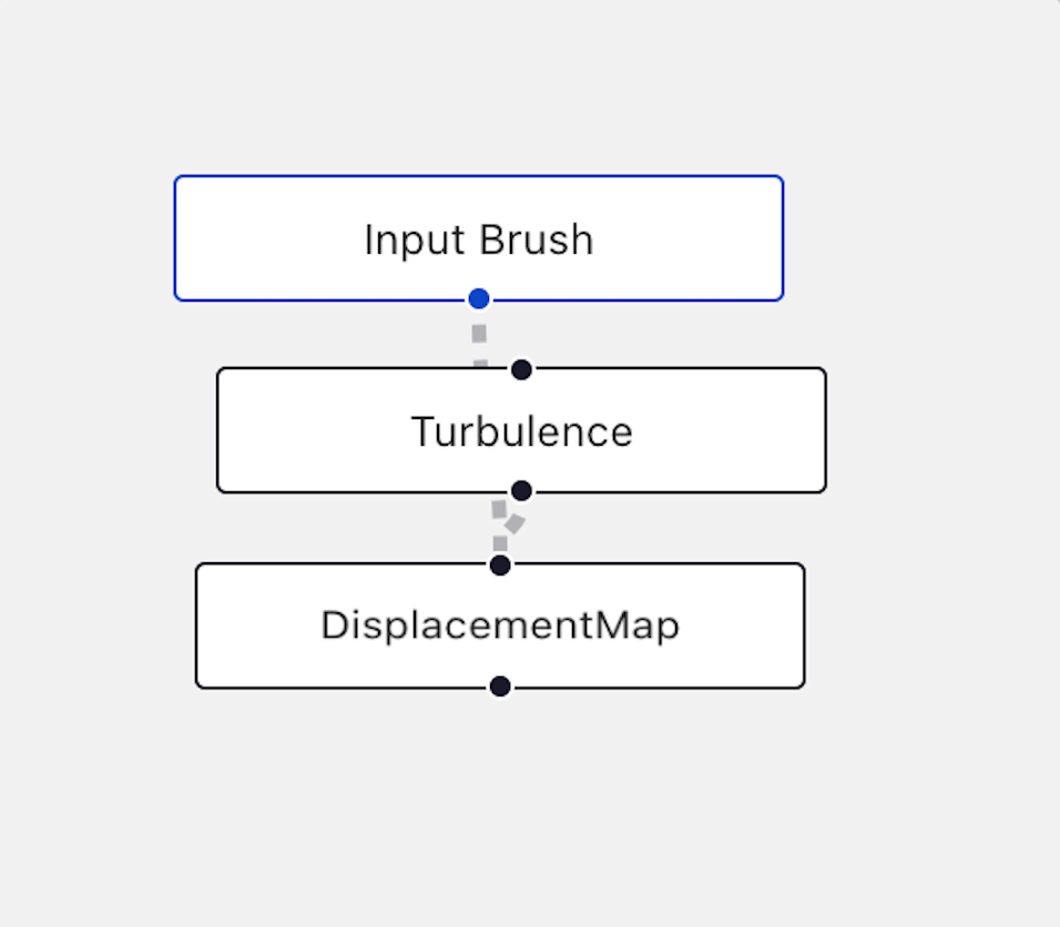
Before:
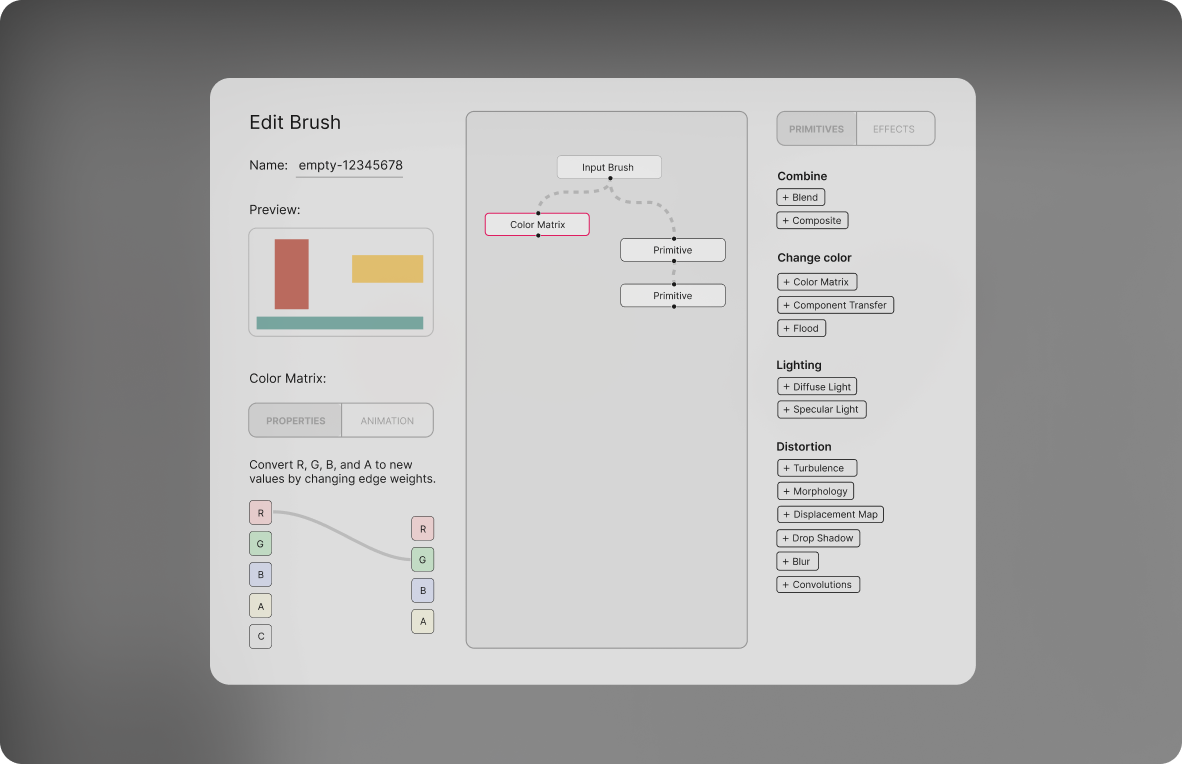
A big usability issue was that the compact size of the existing node-graph editor collapses the entire graph network into a single vertical line, completely obscuring the actual hierarchy and branches. With the overlapping node connections, it was difficult for users to understand the hierarchy of primitives and how their own filters are constructed.
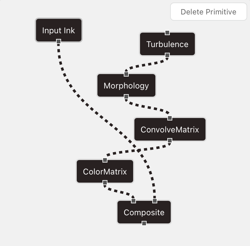
After:
We completely redesigned the nodes and connections to be bolder, and for the connections and relationships between nodes to be much clearer. The new node graph shows how many expected inputs and outputs each primitive can take.
Pain Point 2: Understanding primitive selection
Primitives didn't look clickable, and moreso looked like a list of static features.
[This section is under construction!]
Pain Point 3: Under-utilized functionality
To help users understand and be aware of the functionality and capabilities of our animation tool better, I redesigned the icon of one of the most integral functions of the platform, animation, as well as redesigned the logo of the entire application.
Highlighting animation functionality
One integral goal of the redesign was to emphasize the significance of the animation feature of the platform, and to make this feature discoverable and identifiable in the first place. The previous icon could be mistaken for a video replay button, being reminiscent of playback symbol. The new icon is more indicative of motion and frames, telling of animations.
Defining design style with a logo
The previous logo was a random squiggle, so we thought it'd be important to update the logo to be more telling of the functionality of the app as well as more on-brand with our existing design style. What SVG filters do is nothing short of a bit of magic, and the new logo indicates the sparkle SVG filters add to images. :)
User testing + feedback
Designing and conducting a user study
We conducted a user study on 12 participants, recruited from two neighboring art and liberal arts schools. All participants were familiar with existing vector-based applications and digital drawing tools, but varied in technical coding ability.
User study process and results have been published in CHI 2023
Check back soon!
Reflection
🔎 Designing strong user studies ✍️
Working in a research lab gave me ample time to read a lot of existing research papers and methods, and I learned a lot about how previous studies and user tests have been conducted in the past. From knowing how to phrase questions, to how many people make up an ideal user study, it was an area I appreciated having literature to solidify.
🏛 Writing academic research papers 📚
I had the chance to co-author and write part of a paper that has been submitted to CHI, which is super exciting! I got to experience working in a Human-Computer Interaction Lab and doing academic research, and it's given me insight into what further diving into HCI might look like.