- Make search & discovery functions generous instead of inhibitive
- Undo technical jargon
- Use common names instead of scientific names to minimize barrier of previous knowledge
- Taking after Mitchell Whitelaw's article on generous interfaces, we want to make an application that actively gives information rather than withholding it
- Eye-catching and intuitive visual presentation
- Facilitate personal connection
UX design
HerbUX
I absolutely LOVE 🌱 plants ✨, and was so excited to be the primary UX designer for the HerbUX Project, aiming to make herbarium data easily accessible to the public online. In this ambitious project I was tasked with creating a proposal for a new interface rebuilding the plant specimen discovery mechanism from the ground up.
Role
Experience Designer
Duration
March 2022 - March 2023
Team
Patrick Rashleigh
Rebecca Kartzinel
Timothy Whitfield
Tools
Figma
Background
So… what exactly IS an herbarium?
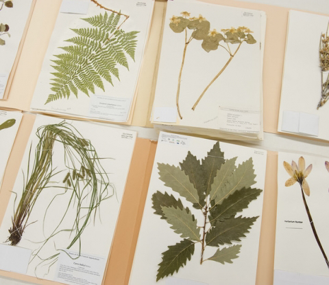
Herbariums are physical collections of preserved plant specimens used for scientific study, representing a critical material history of ecological state and environmental change through time.
Herbarium specimens throughout the world have increasingly been digitized and made available online. The HerbUX project aims to design a prototype interface that increases access to these critical collections for non-expert audiences to be used in classrooms, museums, and other public spaces.
Research
Getting to know the scope of our audience
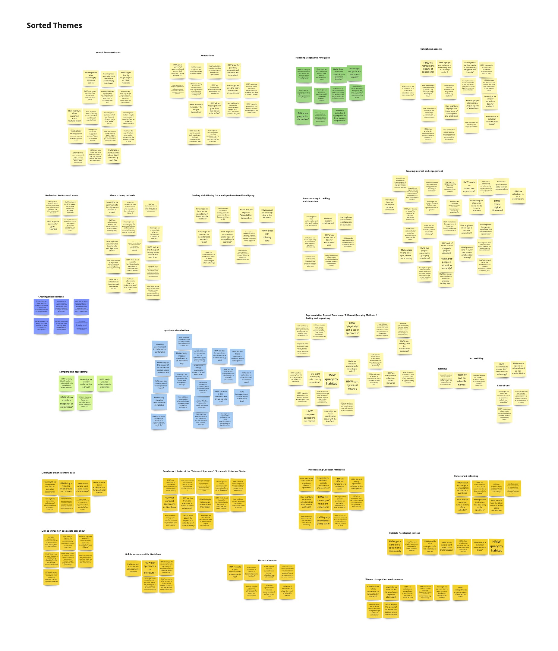
My team and I organized group interviews with three major subgroups—herbarium specialists, science educators, and museum specialists. I sent out a survey to our last subgroup, students, to collect over 400 responses from throughout Brown University and Providence, Rhode Island. From their responses we grouped common themes and identified the following painpoints:
Problem 01
Big words are intimidating
Scientific names can be confusing and completely unintelligible by people without specialized knowledge, making it difficult for them to search and read existing databases.
Problem 02
Lack of visual engagement
Visuals are integral for student engagement; educators pointed out the importance of working with specimen images rather than just spreadsheets of metadata.
Problem 03
Lack of personal investment
Without a professional investment, people rarely have reason to be interested in or to care enough about plants to want to know more about them and their history.
Defining the problem + research synthesis
How might we make the search and discovery of digital plant specimens more friendly and accessible?
Ideation
Design Goal #1: Deviation from standard text-based search
Explorations galore! We sought for alternatives to searching for plants by name, and I conducted a design audit of existing filter interfaces on different websites within and outside of academia. Below are low-fidelity prototypes exploring different search and filter mechanisms.
📍 Filter by map 🗺
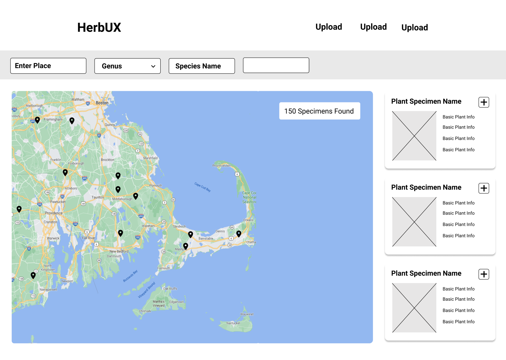
Low-fidelity exploration modeled after Apartments.com, enabling users to specify physical boundaries within which to conduct their search
👓 Filter by attribute 🥾
Low-fidelity exploration modeled after Zappos.com, narrowing down search results via product attributes like size, color, model, etc.
Design Goal #2: Visual-based interaction
Educators voiced a need for digital herbariums to be much more interactive, in order to be visually and mentally engaging. We wondered, What if we brought the physical interaction with an herbarium into the virtual space? We continued to incorporate this physical metaphor into every part of this web application.
✋ Interactive Specimen Images 📚
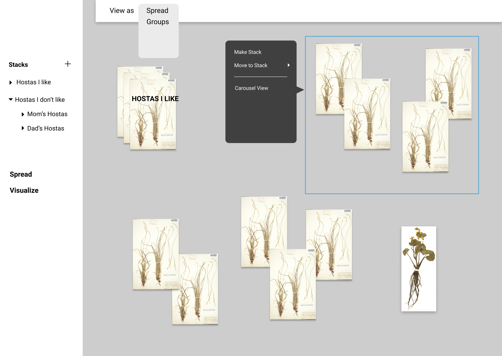
Low-fidelity mock-up enabling users to make 'stacks' and shuffle specimens like they would in-person physically.
🎨 Visual-first layout 🖼
Low-fidelity mockup putting plant images at the forefront of users' interaction with the application.
Design Goal #3: Creating personal investment
I explored different "Choose your own adventure" stepper flows to help ease non-professionals into the world of herbaria, highlighting ways that they could learn the significance of plants in their lives.
✨ 🥭 Food Stepper 🍓 ✨
Low-fidelity prototype of leading students into herbarium collection through food.
✨ 🌱 Houseplant Stepper 🪴 ✨
Low-fidelity prototype of leading students into herbarium collection through houseplants.
User feedback
Interest in plants vs. herbariums
With these sets of possible directions, we ran by each version to botanists and science educators for user testing and feedback. From their interactions we gained valuable insight and critique that:
One of our most central critiques was that while the Food Stepper and Houseplant Stepper, along with the other "Choose your own adventure" explorations, helped curate an interest in plants, they didn't facilitate an interest in herbariums specifically. An interest in plants isn't the same as an interest in herbariums, and we would have to explore a different method of easing students into the herbarium.
Design iteration
Incorporating existing education workflow
Educators voiced that in their current curriculum, they curate a collection of specimens for students to look at, and that set serves as the first introduction to herbarium samples. I decided to bring this existing workflow into the digital space, to enable educators to create collections of specimen to show students to ease them into herbaria.
Curating collections through linked open data
Provides students points of entry through the guidance and curation of their educators.
Here was our final user flow for discovering and browsing plant specimens.

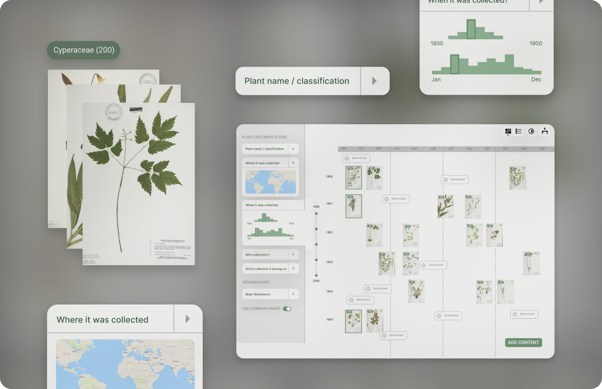
Final features
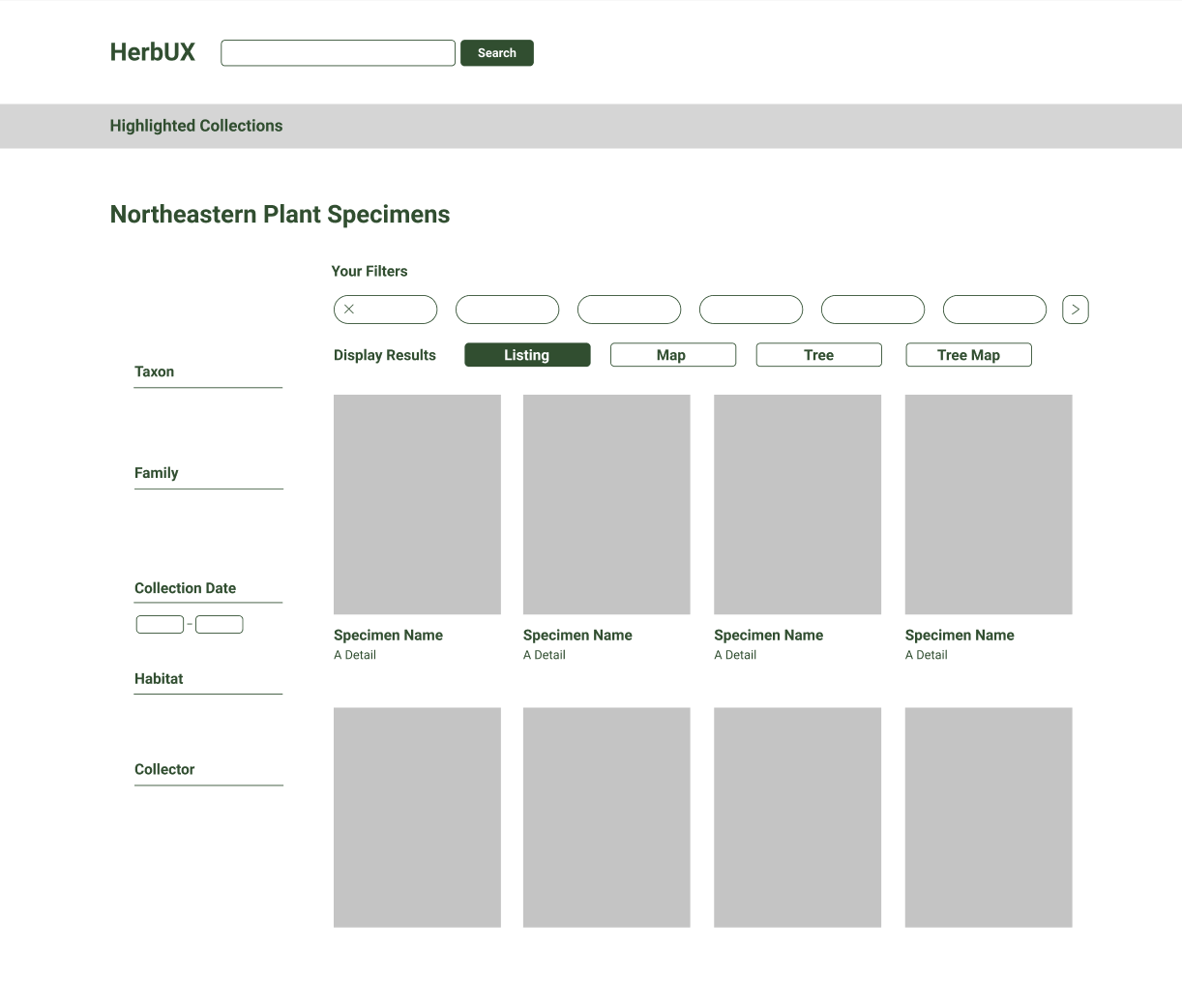
Introducing the digital workbench
Robust and friendly search tools
Deconstructed filter makes it easy to toggle between search mechanisms. Attention paid to visual design principles makes this much easier to use than traditional academia search catalogs.
Simulating physical interaction
Enabling users to manipulate and handle specimens like they would in a physical herbarium. And add annotations!
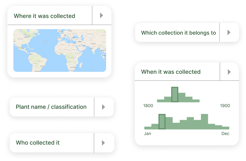
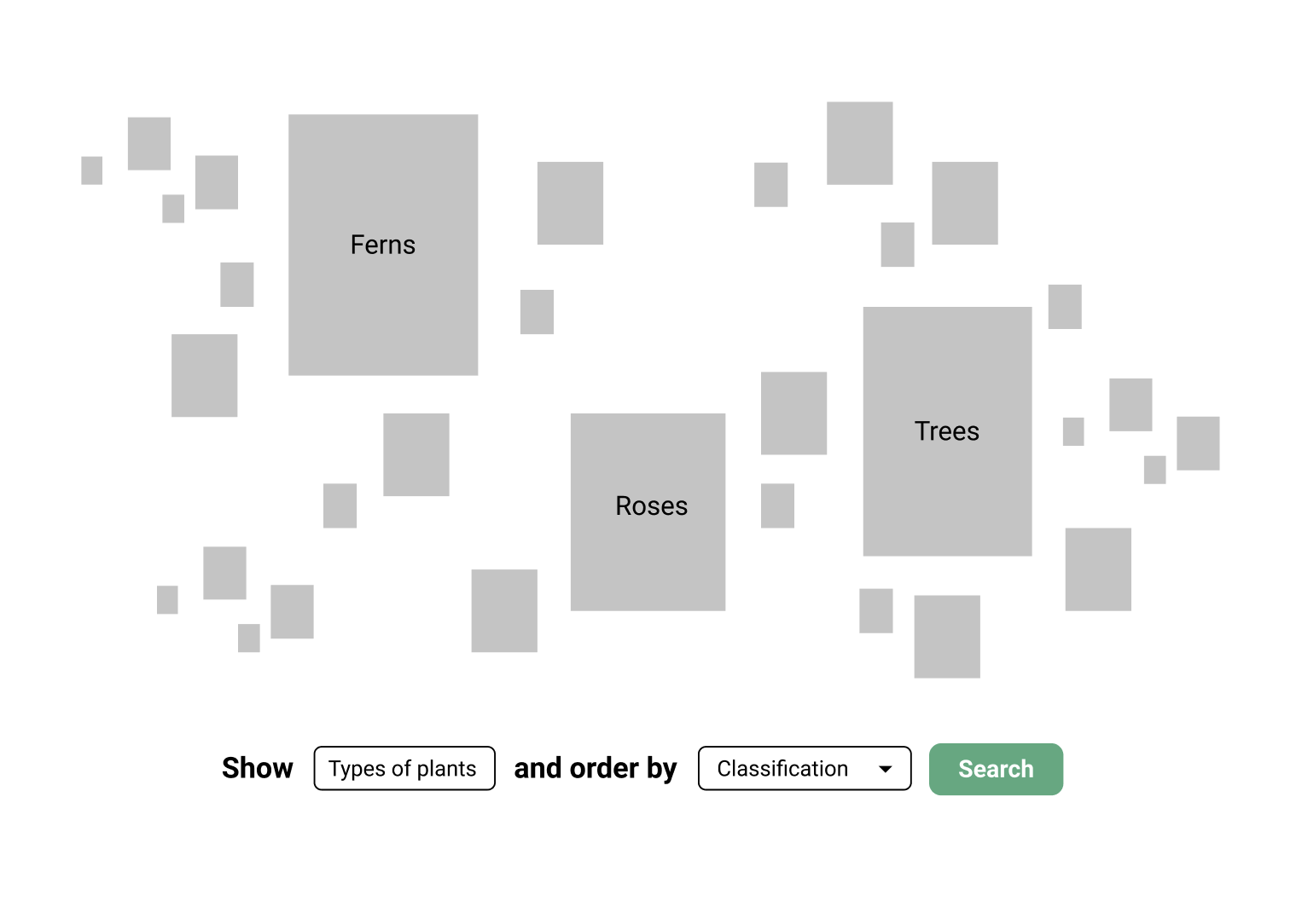
Search beyond scientific names and text parameters
Users can search by map selection, time period on a chronological graph, and visualizations of plant families
Context curation and linked open data
Enabling educators to curate the surrounding data and story of their specimens, as well as the incorporation of external databases and information into local workbench. Provides students endless points of entry.
Reflection
🚧 Large-scale projects
I had never worked on such a big project before, with so many different moving parts. It really taught me how to break down such a huge problem into smaller issues and solve them individually, while maintaining a solid grasp on the bigger picture.
🛠 Don't need to reinvent the wheel
There are some common UI patterns that are popular for a reason, and it wasn't necessary to redesign an identical function from the ground up. I spent a lot of time analyzing existing designs and understanding why they worked, and incorporating those principles into other patterns that needed an update.
🧰 Building a design system early
At the beginning of the project, I made the mistake of not making my ideas into Figma components early, and lost some efficiency by having to go back to update everything individually while still solidifying a design system. Finally creating a design system early on saved me countless more hours and made it much easier to mass-tweak visual branding decisions to establish a cohesive presentation.